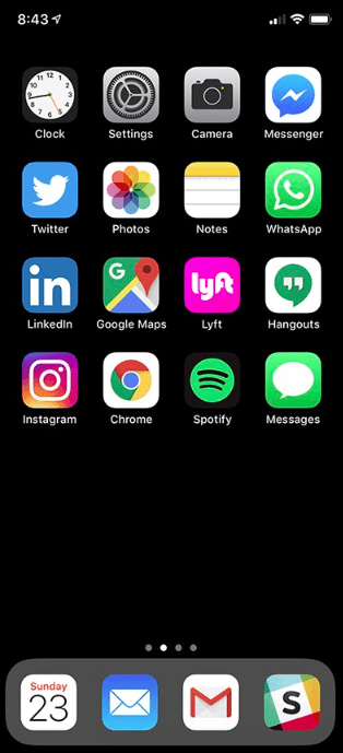
Here’s where I stand as of today:

- I try to limit the number of icons displayed on my homepage to the ones I use every day. The rule is simple: if I haven’t used an app for more than 3 days, I move it to another page. The fact I have less information to look at helps reduce cognitive load 100 percent of the times I unlock my phone.
- I removed all red badges from the homepage icons (except Slack and work email) to reduce anxiety and the feeling that I need to click on certain icons in the first place — because I really don’t. I noticed my phone usage has drastically dropped since I changed that setting.
- Since I realized I’m often holding my phone with my right hand, I moved icons that I need to access quickly to the right side of the screen, so it’s more easily accessible with my thumb. I don’t really need to open Twitter, Linkedin, or Instagram when I’m walking outside holding my phone with one hand and trying to cross a busy street.
The list goes on forever.
I have rules around how my phone’s second screen is organized as well.
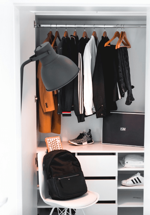
I could write a whole book on the little things I do to optimize my day-to-day experience — not only with my phone, but with my laptop, with my wardrobe, office desk, electric chargers, fridge, backpack. But in all honesty, that would be an incredibly boring book.

The specific rules are not the point (I am not trying to convince you my rules are the right ones, or that they will work for you, and I actually hope you disagree with some of them).
The point is: taking the time to think through what those rules are, and how they are going to impact your everyday.
Why are we not doing the same thing with every single aspect of our lives?
Isn’t that exactly what design is?
Understanding your own use cases
- How many times through the course of a workday do you reach for pen and paper to sketch something out while sitting at your desk?
- What are the shirts you usually choose for weekdays (when you are in a hurry) vs. weekends (when you may have more time, and feel a little more adventurous)?
- What are the 3 things you need to bring with you every time you leave your house?
- What is the cologne you wear everyday, versus the one you wear in special occasions?
It strikes me that so few designers I know actually take the time to think about their own user journey throughout the day.

We use that same logical thinking when designing the app we are working on, when deciding what to include (or not include) on the homepage, when discussing product priorities with our coworkers, when defending our design decisions to your clients.
Still, sometimes we forget to apply those same principles to our own life.
Designing your life begins with designing the environment around you. It makes logical sense: with the efficiency you gain by designing your own experience, you will end up with more time to design experiences to other people.
Defining your personal KPIs
Design is all about making decisions that prioritize one metric over another. What metrics are important to you?
- Less time spent: what are the tasks you repeat every day that can be optimized or automated to save you time?
From using Buffer to schedule my social media posts, to setting up if this than that recipes that will help me manage the UX Collective; I’m constantly paying attention to time-consuming tasks that are repeated at a certain frequency, and finding ways to automate them or eliminate them altogether. - Less forgetting: how can you reduce the number of times you forget things?
Setting monthly reminders to pay the bills, yearly birthday reminders for the people you love, or even daily reminders for more mundane tasks; it only takes a minute, and can save you a lot of frustration and energy later on. - Less decision-making: how can you reduce the number of decisions you have to make throughout the day?
As a designer, you are making hundreds of decisions at work, so you might want to reduce decision fatigue in other parts of your day. Make sure to define your personal priorities: some people (like me) prefer to wear the same color every day to avoid decision-making in the morning, but do not want to give up on choosing a different restaurant every night — or vice-versa. - Less cognitive load: how can you free up your brain from processing excessive amounts of information all the time? Look at the world around you with the eyes of a designer. Aren’t there too many pictures on your living room wall? Too many objects sitting on your desk? Too many apps on your phone home screen? Take a pass at every environment you interact with throughout your day and ask yourself the question: what can I eliminate from here to open up more breathing room for my eyes and brain?

Owning your daily experience
Being mindful of your own daily experience shows that you care about yourself and others around you. As designers, we spend so much energy thinking about our user’s experience that we forget that, as humans, we deserve better experiences too.
It’s time we move from default choices to more deliberate ones. At every aspect and every level of our lives.
This article was originally published on UX Collective by Fabricio Teixeira.
Read next: Two more universities get into blockchain education with specialized online courses


