We’ve been hearing rumblings of a redesigned Twitter.com for months, but it’s finally here. The social network today revealed its new look – designed to better line up with its mobile apps – is rolling out to users today.
Woah, what’s this? A shiny new https://t.co/q4wnE46fGs for desktop? Yup. IT’S HERE. pic.twitter.com/8y4TMzqBGa
— Twitter (@Twitter) July 15, 2019
Hard Fork!
Hard Fork?
Cleaner aesthetics aside, there are a few key functionality changes:
- The ‘Explore’ tab is now available on desktop, making it easier to find live video and local moments based on your location.
- Bookmarks, lists, and your profile are easier to access with their own spots in the side navigation menu.
- Direct Messages now have a larger view, allowing you to respond to messages and see your various conversations on the same screen.
- The sidebar menu makes it easier to switch between accounts
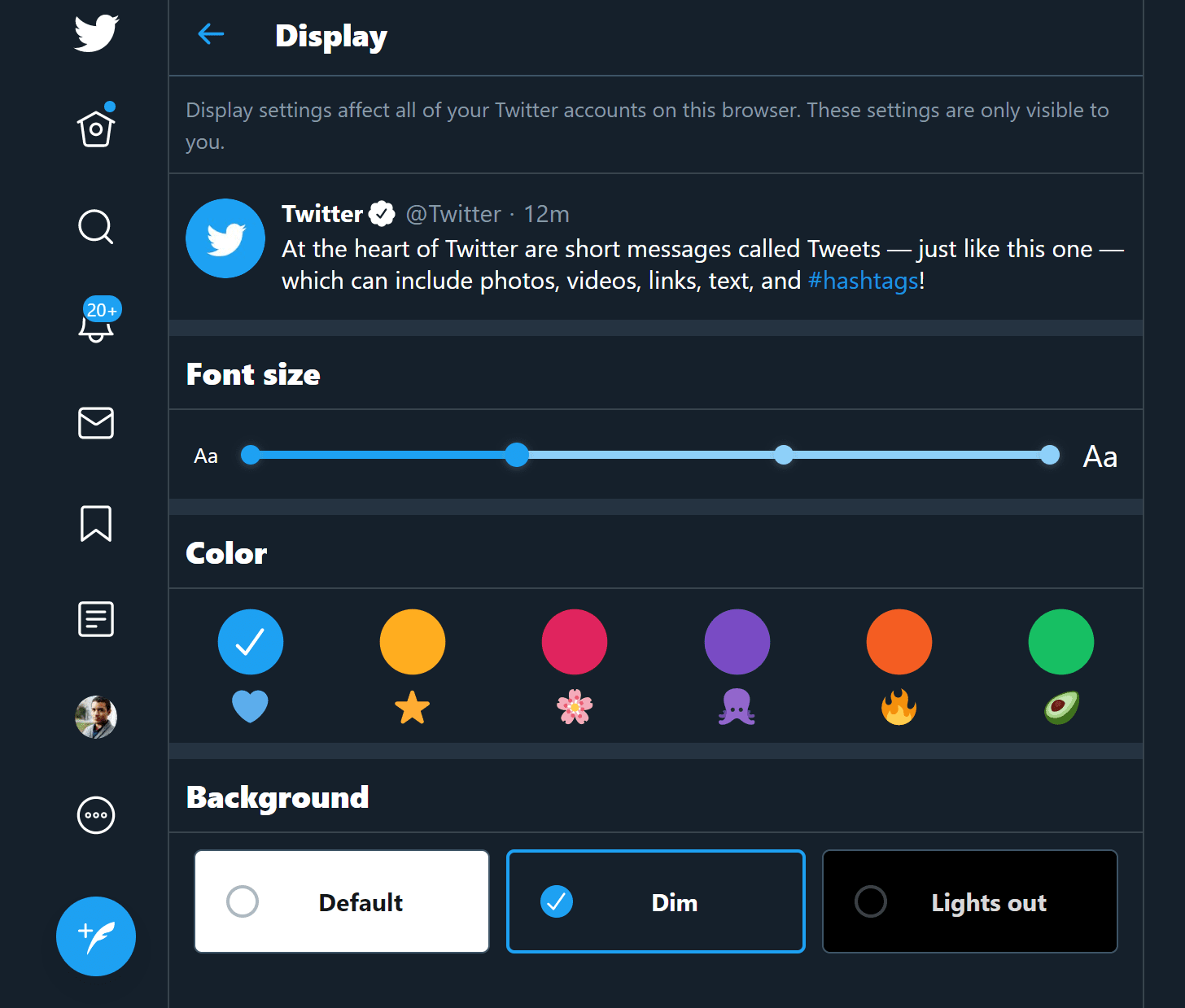
- You now have two options for dark mode, as well as various themes and color options.
These changes are built upon a major revamp of Twitter‘s back-end architecture – the company says it rebuilt Twitter.com from scratch.

Among its goals were creating a faster, more efficient platform, and ensuring mobile users have access to the same breadth of features as desktop users. Tablet users, for example, will be able to use the same keyboard shortcuts as desktop users. Moreover, the new site will only load features as you need them, helping save data for those on metered connections.
Twitter says it received “hundreds of thousands of responses” during its test period, guiding the final design. As usual, the internet is likely to be divided on a new look, but at least this one brings some meaningful improvements.
The design is rolling out gradually now, but if you don’t have it yet, you can go ahead and try it by clicking on your avatar and selecting “Try the new Twitter.” Be warned: once you switch, you can’t go back.
on Twitter
Read next: Gears of War 5 reworked to remove smoking it apparently never had


